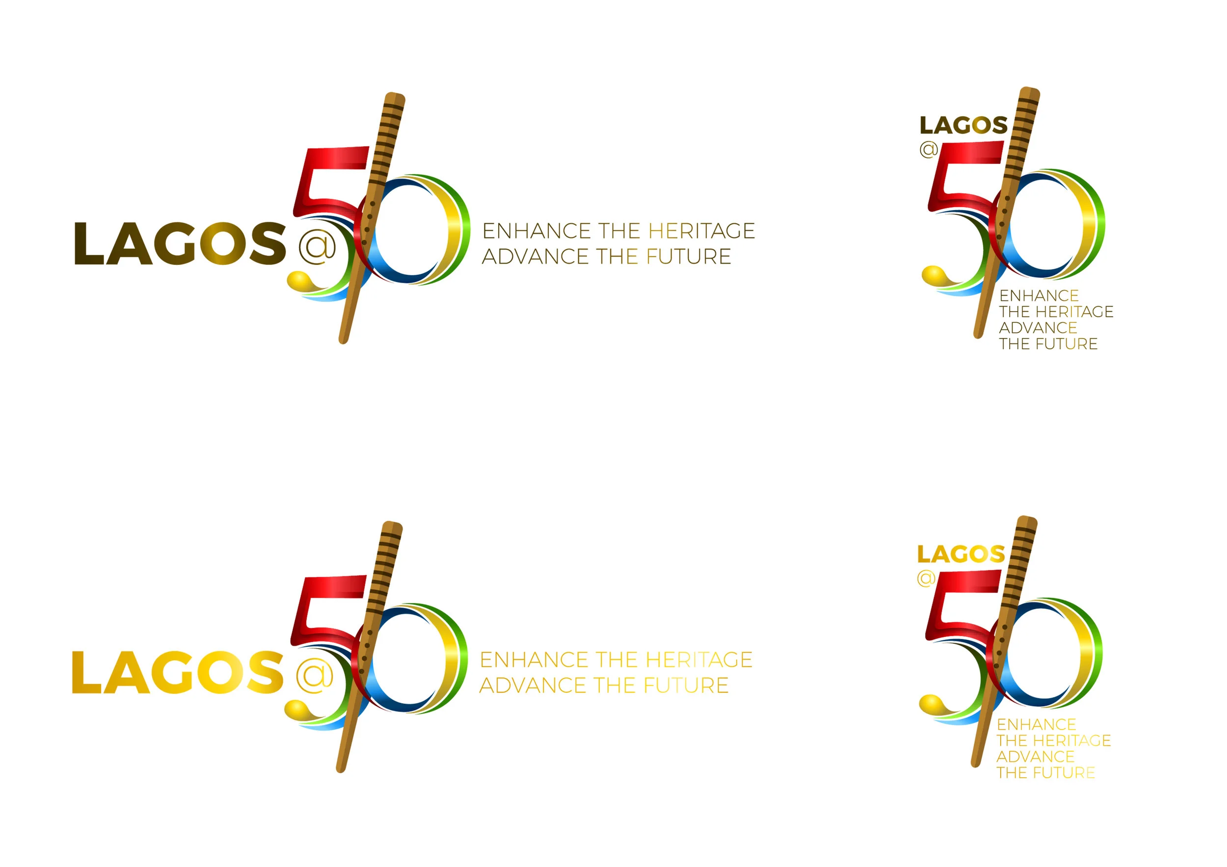
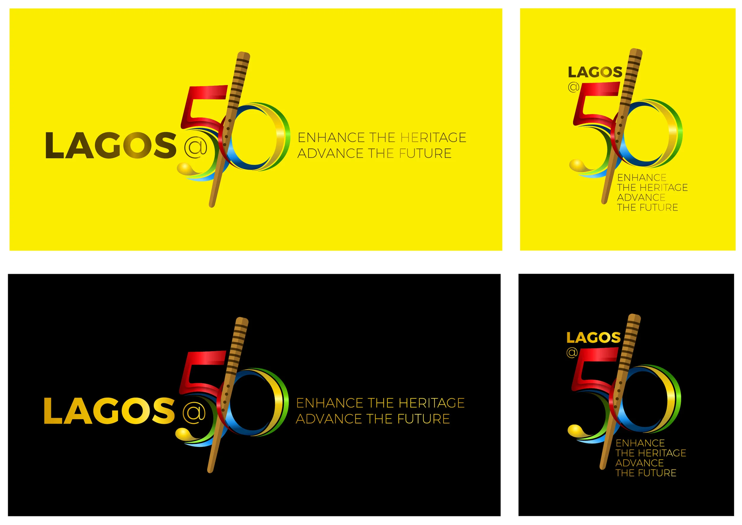
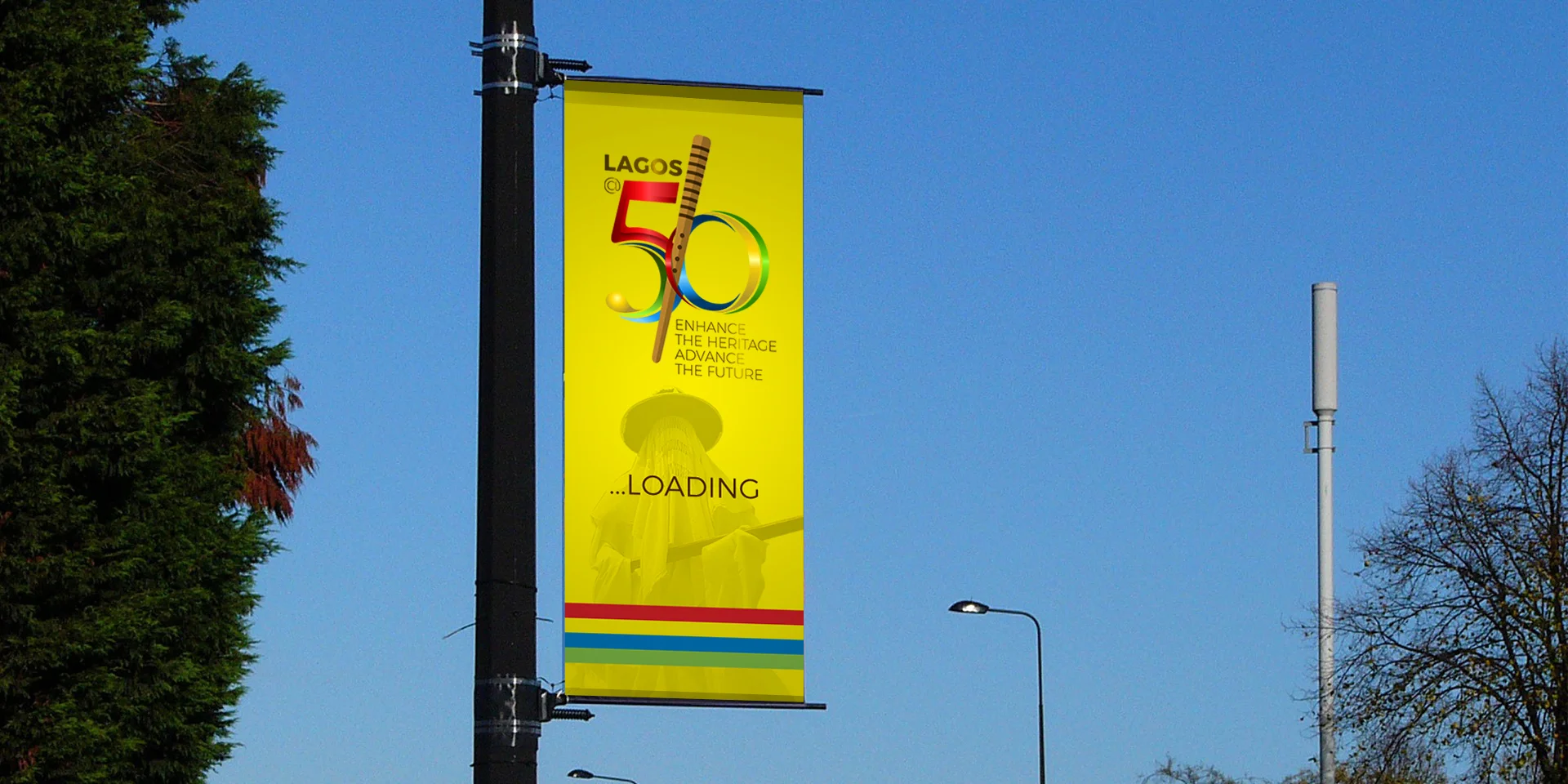
WHO APPROVED THIS?
I went through the members of the committee that is in-charge and I was traumatised by the calibre of people that gave thumbs up to this. "This is why politics alone can not take us to the future".
Design is meant to make things beautiful,
Design is meant to simplify all manners of complexities, non of which is portrayed in the logo above.
THE IDEA is very good using some of the symbols of Lagos but it wasn't carefully arranged.
WHAT IS WRONG WITH THIS LOGO?
It lacks form, discipline, order and professionalism all of which Lagos represents lately and why use black as a background?
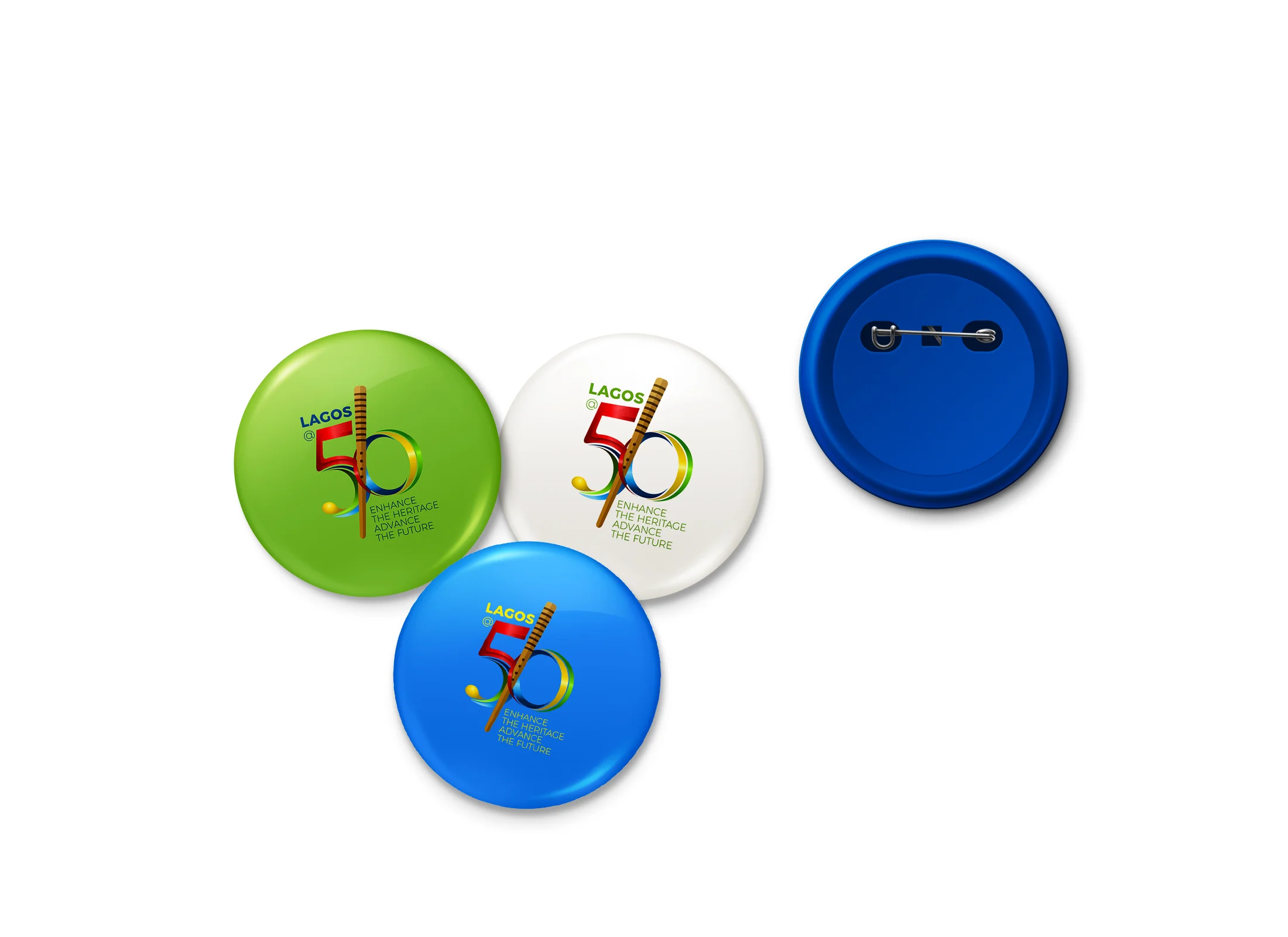
A logo that looks good on screen and does not look good on any other medium it is printed on is not a job well done.
The world is watching and what is used to describe us is very paramount to what we want to achieve and where we are going.
We are here, we are professionals, we are plenty, we know our onions and we would not accept mediocrity any longer in our society.
If only the committee had made this a professional brief, I am very certain that some professional Nigeria graphic designers would murder the brief and shred it into pieces.
Is this how we "Advance The Future?". It is surely "Enhancing our heritage" of playing politics with everything that matters and not giving the job to the best hands. This celebration is meant to attract tourists and investors as "they claim" which I believe would happen but at least let us show them what we are truly made of by letting "professionals" handle their things. We can export great services too.
I am just pissed!!!
I do not have any personal beef for the designer. I don't know him from anywhere. I like his idea like I said earlier and I do not intend to create another logo to compete with his (the competition was a year ago). I just applied design principles to the work and show what it could be. We need to start applying strict design principles to our works. We apply these things in architecture, interior design, product design etc. why should graphic design be left out?
Works produced through graphic design and displayed in any city around the world is part of the landscape and would be a reference point for a long time (LONDON 2012 is an example).
While art is freedom to express anything, Design puts form and order into it. Every product, every brand, every beautiful object we might love were sketches first (the reason why scamping is very relevant today) but as soon as it is to be executed (outdoor prints inclusive), the game changes and only those that apply design principles would be able to deliver the work as it was sketched or far better than it was sketched.
If for the sake of ART, then I would let it pass.
If for design, my stand is NOOOOOO!
It does not "werk" for me.
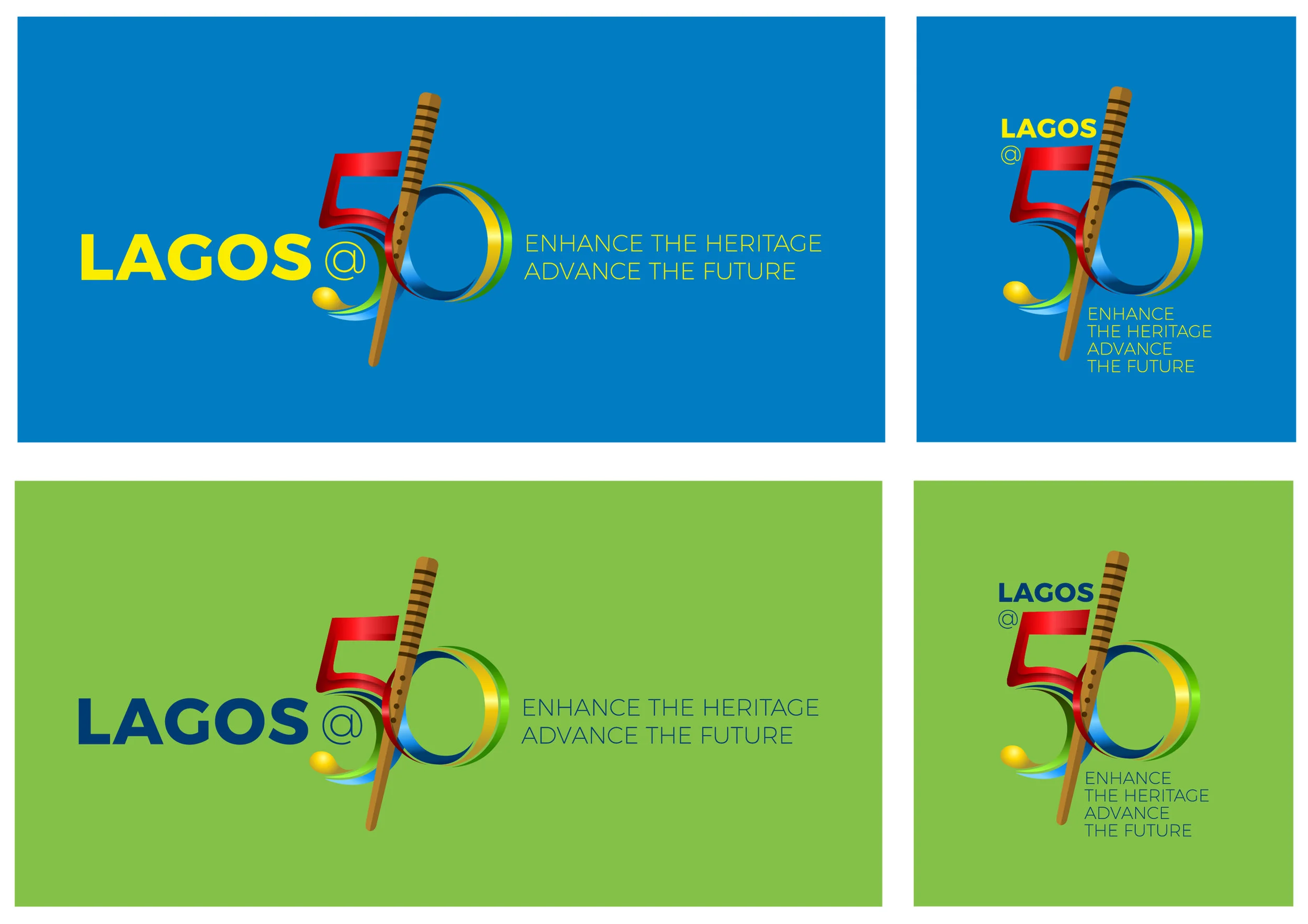
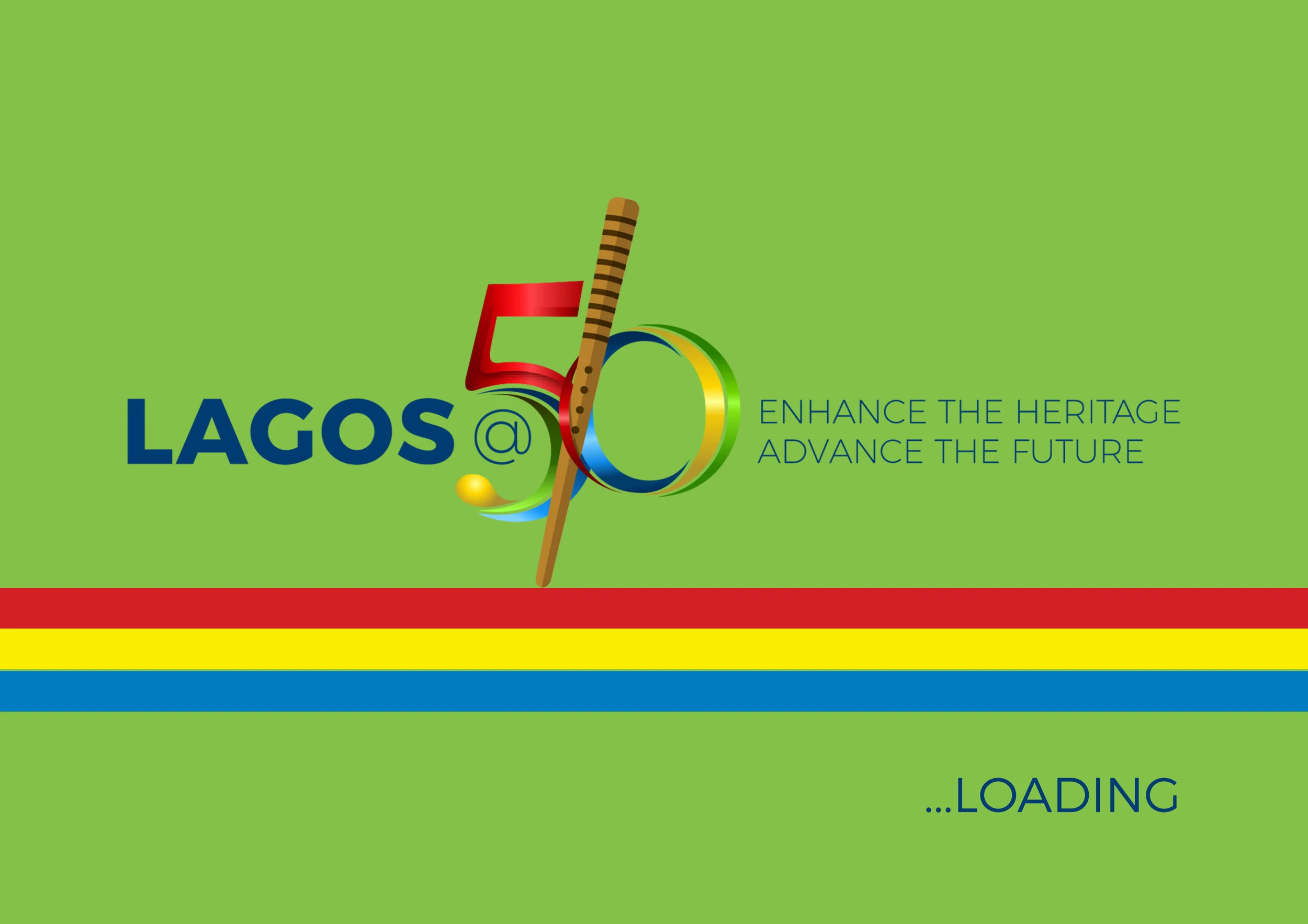
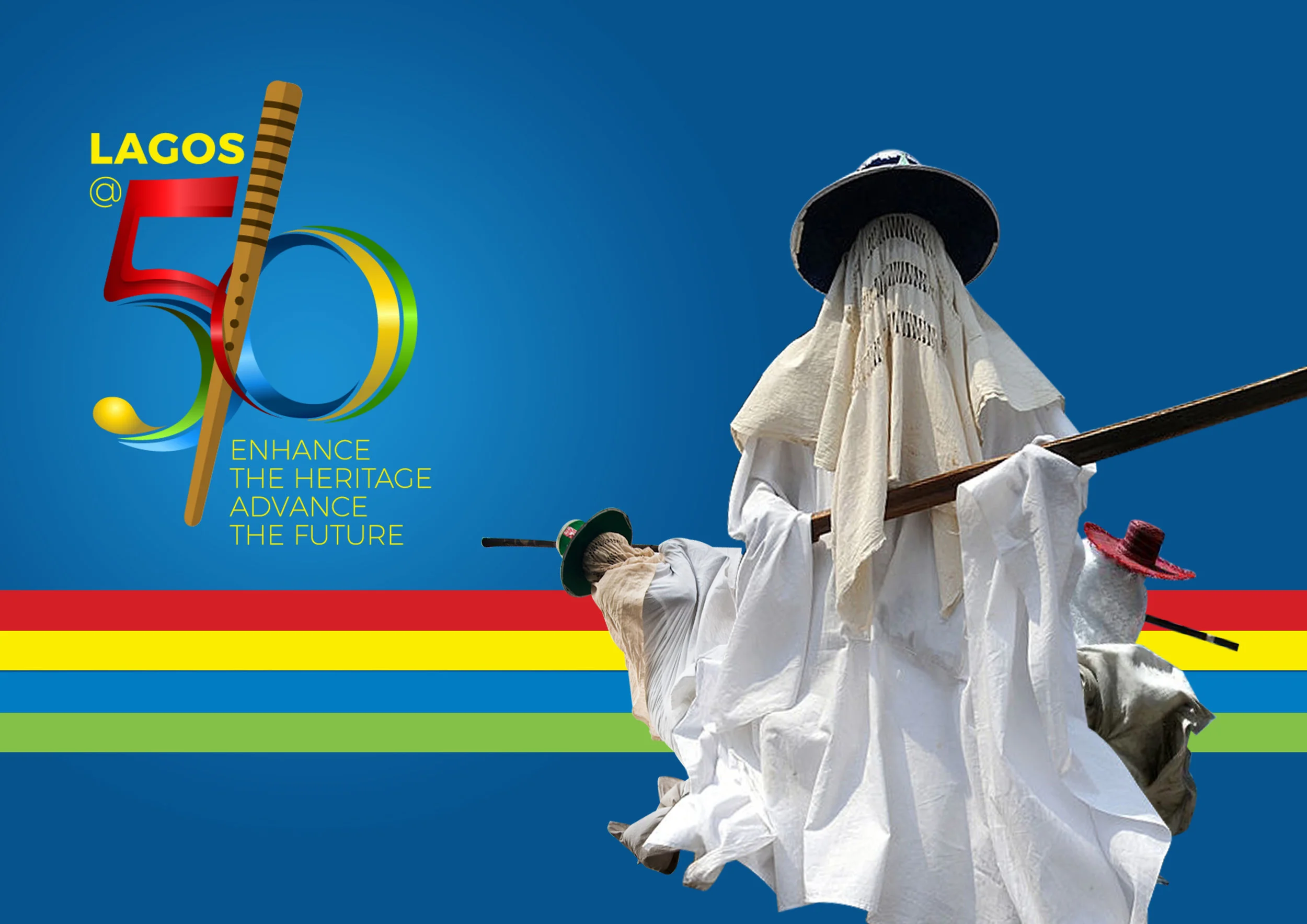
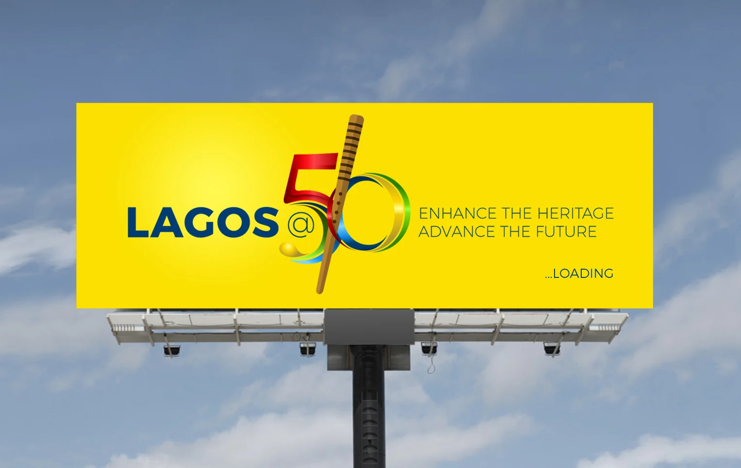
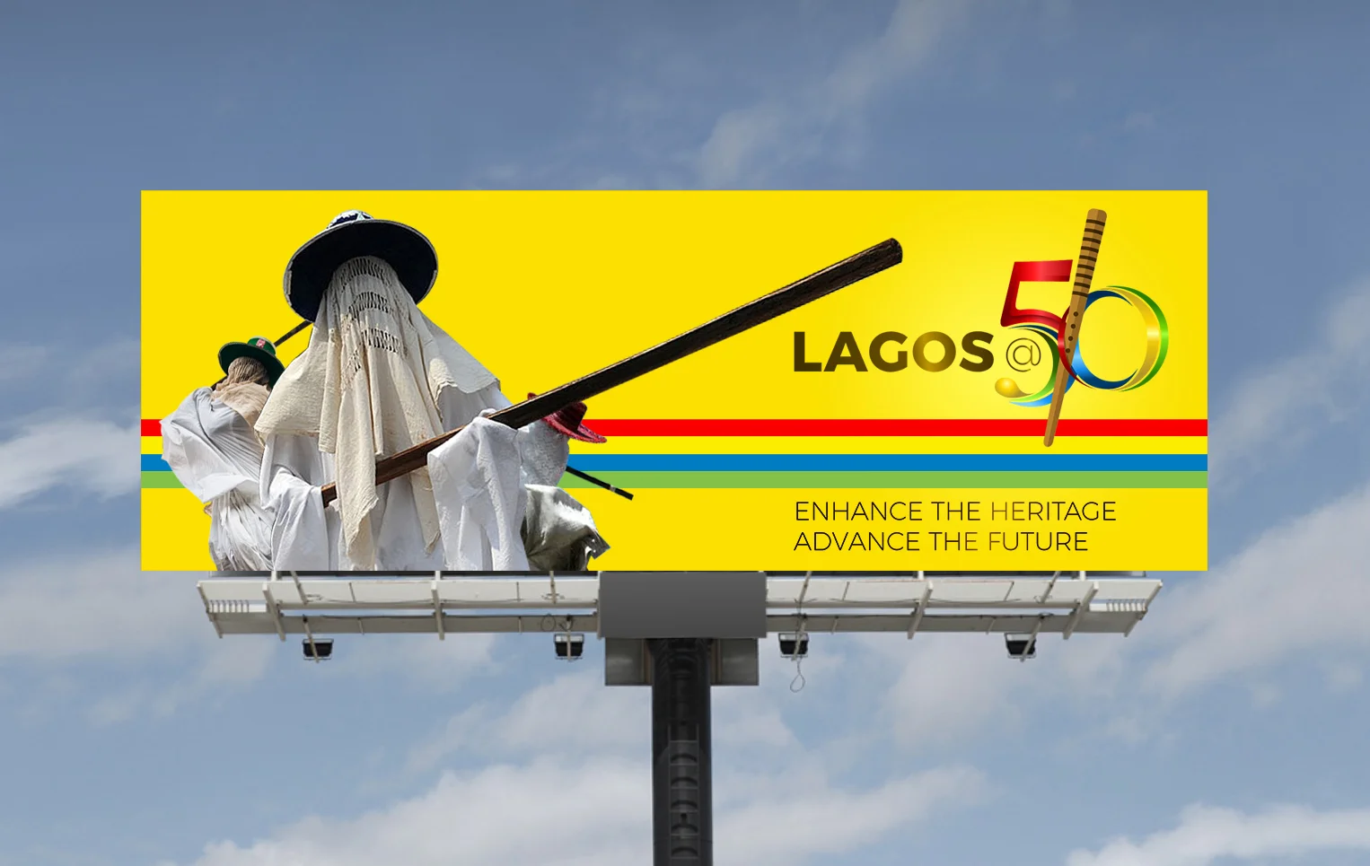
If design principles like uniformity, clear space rule were adhered to, "maybe" it would look like what is below. Again, I am just applying design principles to the logo above and not creating another one. I am very sure several graphic designers I know would have done something better.


